The inspiration behind the naming and the logo of “Grand Green Osaka,” a fusion of greenery and innovation
Theme:Project name & logo
 Share on Twitter
 Share on Facebook
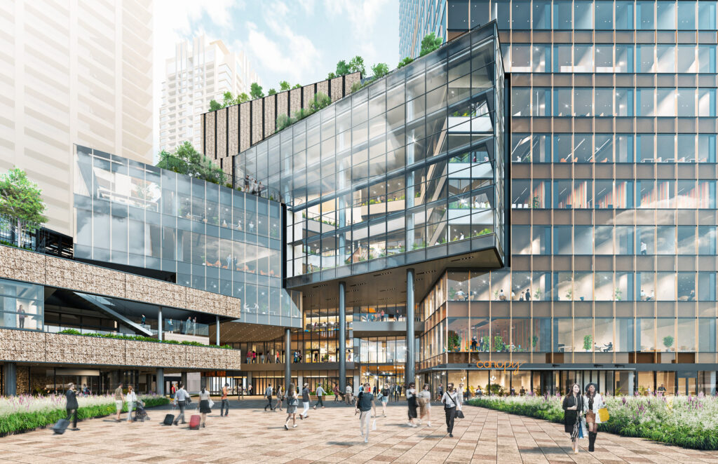
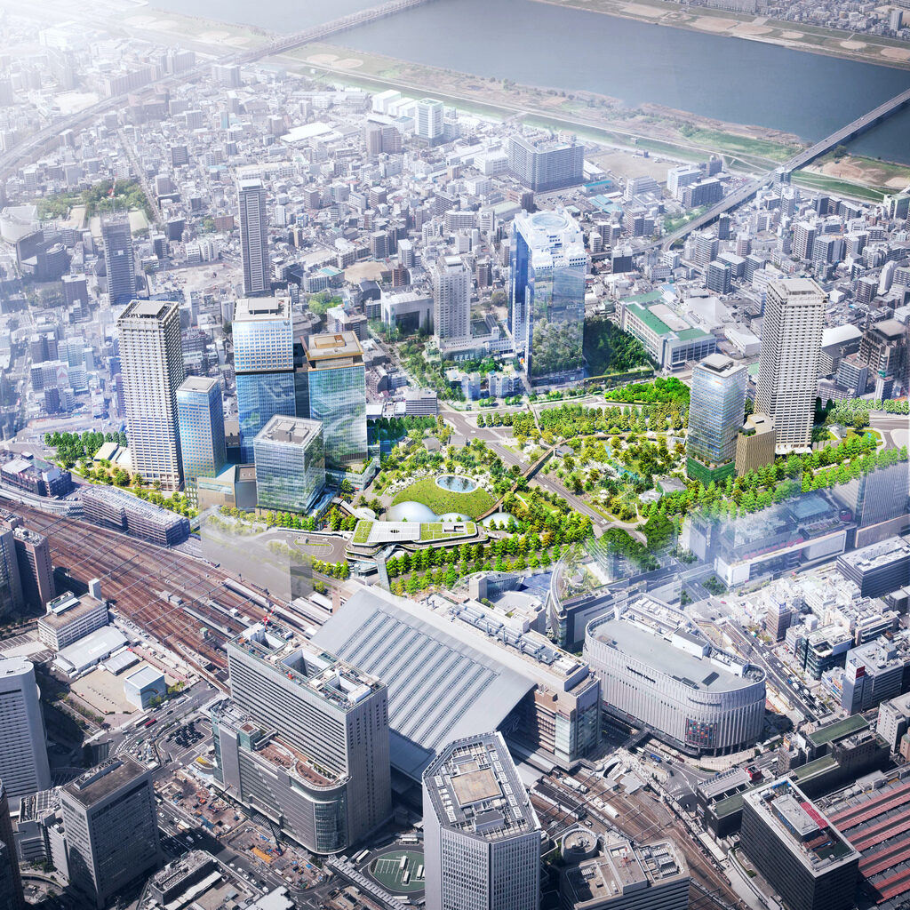
The Umekita 2nd Area Development Project will partially open in the summer of 2024.
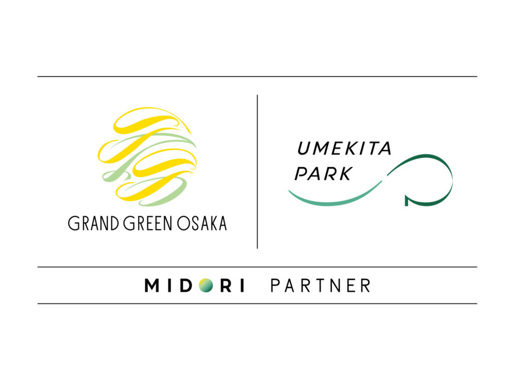
“Grand Green Osaka” has been chosen as the name of the project. A logo symbolizing the town has also been premiered with the project name, as the pace of work in the final development of this new townscape accelerates. We spoke with the developers of the Umekita 2nd Project and the designers of the logo about the naming of the town, a fusion of “green” and “innovation” centered around an urban park, and about the creation of its symbolic logo.
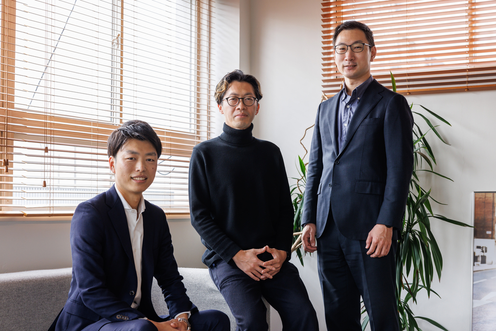
Mr. Taniguchi of Orix Real Estate went first in talking about the struggle in trying to settle on a name for the project. “Creating a name for the new town was very hard. In the end, we probably came up with about 200 possible names.”
Reflecting on those days, Mr. Kimura of the Takenaka Corporation says, “Some of the nine developers on the Umekita 2nd Project had been involved in the first phase of the Umekita development project, such as with the Grand Front Osaka complex of shops and other facilities. So although they were all passionate about this development, they came with different perspectives, which proved tough to bring together.”
Mr. Taniguchi explains the process leading up to the final decision on the project name. “Prior to considering the name, we took a close look at what defines the essence of the Umekita 2nd Project. Then, we established three basic criteria based on our discussions. Firstly, it should convey the image, characteristics, and concept of the Umekita 2nd Project. Secondly, it should sound attractive to a wide spectrum of people, regardless of age, nationality, or race. And finally, it should help to enhance the brand value of the Umekita 2nd project as a town asset over the course of time, such as twenty—or even fifty—years later. And so the developers discussed ideas for a name satisfying those three conditions.”

However, the process for deciding the name was hard, and it took about half a year from deciding on the naming protocol until they were finally able to submit their trademark application.
Taniguchi recalls, “We were able to narrow it down to just thirty at one point, but while reviewing those possible names, many different opinions were expressed, including that the direction for the nomenclature had shifted. In order to find a resolution, around a hundred new names were proposed, resulting in many further twists and turns.
“The crucial point in narrowing down these ideas was that the name must invoke a sense of unity for the entire Umekita area, including the previously developed Grand Front Osaka area. Then, through prolonged discussions, the list was narrowed to ten ideas, then four; and eventually a decision was arrived at from the two finalists.”
The name “Grand Green Osaka” is intended to convey the various aspirations of the developers of the Umekita 2nd Project while remaining compatible with the adjacent Grand Front Osaka complex, and also evoking an image of the luscious greenery in the urban park.
Mr. Kimura comments, “Grand Front Osaka celebrates its tenth anniversary this year, so its name is already familiar to the general public. However, not many people appreciate that Grand Front Osaka represents the initial development for this vast area, or its connection to the Umekita 2nd Project. In considering the name, we also wanted people to realize that Grand Front Osaka and Grand Green Osaka together form a new townscape.”

The logo is intended as a visual expression of the new town’s name—“Grand Green Osaka.” A competition was held, and a design comprised of organic forms in yellow and green was finally chosen as the logo. If you examine it carefully, you can make out two overlapping G’s in a cursive style in yellow. The design was created by Hiroki Sakaguchi of Harbor Inc., a branding design company. He says that creating this logo was a hard process. “When I heard that the project name was Grand Green Osaka, I immediately thought it would be difficult (laughs). The reason is that everyone associates the word ‘green’ with nature, such as green leaves and trees. The logo needed to match the brand without being run-of-the-mill. I struggled with how I could express the uniqueness and future vision of this town in the Umekita 2nd Project’s logo, which at the same time needed to be an orthodox image as it is to be used for many decades to come.”

When creating a brand logo for a company, Mr. Sakaguchi normally holds in-depth talks with the management to fully digest their conceptual ideas and the future they envision for their company.
“However, as it was a competition, we had limited time to come up with a proposal, so I submitted a design based on our future image of the Umekita 2nd Project,” he explained. “The first thing that struck us was its continuity from the prior development in Grand Front Osaka. The Grand Front Osaka logo is made up of six largely vertical lines, and I wondered whether these six lines couldn’t be adapted, so I tried dozens of designs that played with these lines, such as straight, rotated, and even trapezoid.”
Another key point they noticed in analyzing the Umekita 2nd Project was landscape. “We were particularly struck by the phrase ‘fresh breath of verdant green’ in the stated concept for the Umekita 2nd Project, and struggled with how best to convey that in our design. The reason for adopting yellow is that this color expresses sunlight, which gives life to all greenery, and stimulates the swift growth of buds, branches, and leaves. I wanted to convey the impression that the Umekita 2nd Project offers a space conducive to the birth of a fresh breath and a bright future.”

How did the project developers react to a logo conveying the sun and breath? Mr. Kimura recalls their impressions of the logo at the time of the competition.
“On first seeing the logo, I was taken aback at how yellow was used rather than green. I had simply assumed that green should be used because it’s in the project name, so I was caught off-guard by their perspective that yellow—representing the sun—is essential for healthy greenery. We were impressed by this viewpoint.”
Mr. Taniguchi also explains the reasons for its adoption. “One of the decisive factors was that it maintained a cohesive balance with the logo for Grand Front Osaka. However, in contrast to the linear design adopted by Grand Front Osaka, this logo was highly rated as it incorporated the overall design concept of fluidity.”
Mr. Kimura notes, “The Umeda Sky Building was completed in 1993, with the Grand Front Osaka complex opening in 2013, and the Umekita 2nd Project will partially open in 2024, thus finally integrating the Umekita area after some three decades. Normally, roads connect different areas of a town, but in this case a large urban park forms the connective tissue. The hope is that this park will attract a nice mix of local residents and workers, shoppers, and tourists.” As per his explanation, the “Grand” in Grand Green Osaka really means that. One can almost sense the wide diversity of persons congregating in the spacious greenery of the park, the fresh breath of nature there, the human vitality on view, and the spirit of innovation.
The name “Grand Green Osaka” will clearly convey an image of this new townscape surrounding the park, and the logo design that symbolizes that new urban concept is sure to be loved by visitors for years to come.
Portrait photos: SADAHO NAITO Text: AKIKO WAKIMOTO